Chapter 7 Synthesis
Synthesis involves the consolidation of disparate outputs and is the final task. This will be the focus of this Chapter.
library(masmr)
library(ggplot2)
## Warning: package 'ggplot2' was built under R version 4.3.27.1 Unifying outputs
As a consequence of running scripts from preceding chapters, we expect three subdirectories in the user-specified output directory: one for spotcalling outputs (IM), one for cell segmentation (DAPI), and one for stitching (STITCH). The outputs from these three subdirectories will be combined, and output into a final OUT subdirectory.
For illustrative purposes, we have processed just nine FOVs below. Also note the removeRedundancy parameter currently set to FALSE – this will be explained later.
data_dir = 'C:/Users/kwaje/Downloads/JIN_SIM/20190718_WK_T2_a_B2_R8_12_d50/'
establishParams(
  imageDirs = paste0(data_dir, 'S10/'),
  imageFormat = '.ome.tif',
  codebookFileName = list.files(paste0(data_dir, 'codebook/'), pattern='codebook', full.names = TRUE),
  codebookColumnNames = paste0(rep(c(0:3), 4), '_', rep(c('cy3', 'alexa594', 'cy5', 'cy7'), each=4) ),
  outDir = 'C:/Users/kwaje/Downloads/JYOUT/',
  dapiDir = paste0(data_dir, 'DAPI_1/'),
  pythonLocation = 'C:/Users/kwaje/AppData/Local/miniforge3/envs/scipyenv/',
  fpkmFileName = paste0(data_dir, "FPKM_data/Jin_FPKMData_B.tsv"),
  nProbesFileName = paste0(data_dir, "ProbesPerGene.csv"),
  verbose = FALSE
)
## Assuming .ome.tif is extension for meta files...synthesiseData(removeRedundancy = F)The files created in the OUT subdirectory are as follows:
OUT_CELLEXPRESSION.csv.gz: Gene expression per cell. [Only created if there are matching spotcall and cell segmentation files for that FOV.]OUT_CELLS.csv.gz: Cellular coordinates, sizes, and other metadata.OUT_CELLSEG_PIXELS.csv.gz: Concatenated cell segmentation masks across all FOVs, with a unified coordinate system.OUT_GLOBALCOORD.csv: Updated global coordinates for each FOV.OUT_SPOTCALL_PIXELS.csv.gz: Concatenated spotcall dataframes across all FOVs, with a unified coordinate system.
list.files( paste0(params$parent_out_dir, '/OUT/') )## [1] "OUT_CELLEXPRESSION.csv.gz" "OUT_CELLS.csv.gz"
## [3] "OUT_CELLSEG_PIXELS.csv.gz" "OUT_GLOBALCOORD.csv"
## [5] "OUT_SPOTCALL_PIXELS.csv.gz"Currently, with removeRedundancy turned off, dataframes are simply concatenated. This is problematic because FOVs overlap, causing spots to be counted more than once. This can be seen at FOV boundaries, that have higher count densities.
spotcalldf <- data.table::fread(paste0(params$parent_out_dir, '/OUT/OUT_SPOTCALL_PIXELS.csv.gz'), data.table = F)
cowplot::plot_grid( plotlist=list(
  ggplot() +
    geom_hex(data=spotcalldf, aes(x=Xm, y=Ym), bins=100) +
    scale_fill_viridis_c(option='turbo') +
    scale_y_reverse() +
    theme_minimal(base_size=14) +
    xlab('X (microns)') + ylab('Y (microns)') +
    theme(legend.position = 'none') +
    coord_fixed() +
    ggtitle('Spot density'),
  ggplot() +
    geom_point(data=spotcalldf, aes(x=Xm, y=Ym, colour=fov), shape='.', alpha=0.5) +
    scale_colour_viridis_d(name = '', option='turbo') +
    scale_y_reverse() +
    theme_minimal(base_size=14) +
    xlab('X (microns)') + ylab('Y (microns)') +
    guides(colour=guide_legend(override.aes = list(size=5, shape=16), ncol=1)) +
    coord_fixed() +
    theme(legend.position = 'none') +
    ggtitle('Spots by FOV')
), nrow=1)
We would expect there to be more cells, and more counts per cell.
cellExp <- data.table::fread(paste0(params$parent_out_dir, '/OUT/OUT_CELLEXPRESSION.csv.gz'), data.table = F)
rownames(cellExp) <- cellExp[,1]
cellExp[,1] <- NULL

hist(log10(1+colSums(cellExp)),
     main = paste0(
       'Cells x genes: ', paste( dim(cellExp), collapse=' x '),
       ', Median nCounts: ', median(colSums(cellExp))),
     breaks=25, xlab = 'Log10 nCounts per cell');
abline(v=log10(1+median(colSums(cellExp))), col='red')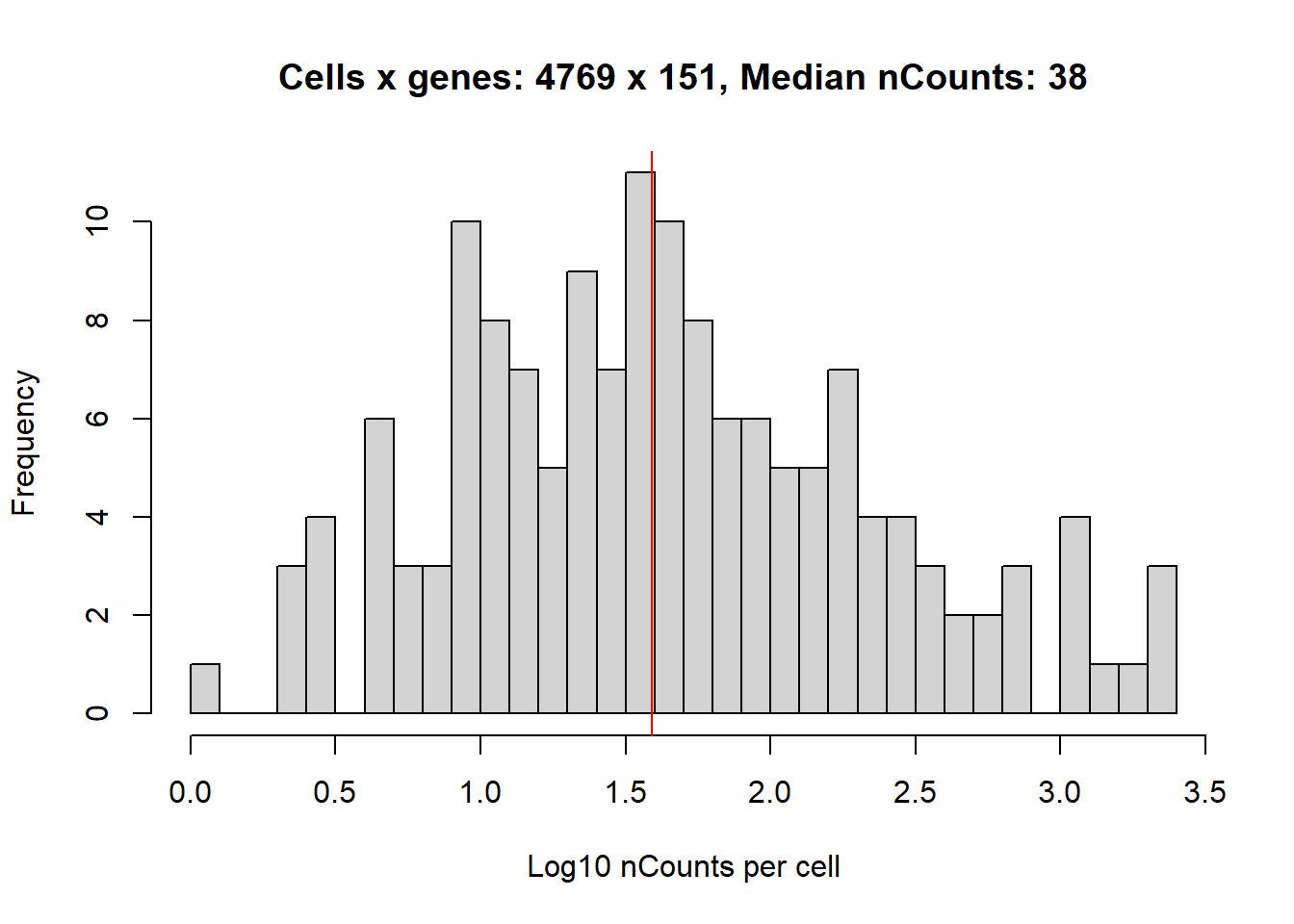
To address this problem, we can turn removeRedundancy on (this is TRUE as default), which has the effect of:
- Removing redundant spots: Spots per FOV in the overlapping region are counted. The FOV contributing fewer spots in the overlapping region is ignored.
- Removing redundant cells: If cells from different FOVs overlap <\(X\)%, overlapping pixels are simply disregarded. However, if overlap >\(X\)%, then one of the cells has to be removed. In general, we drop smaller cells or cells that overlap with more than one cell in another FOV. The choice of \(X\) depends on the
cellOverlapFractionparameter (default is 0.25, i.e. 25%).
synthesiseData(removeRedundancy = T, cellOverlapFraction = 0.25)## Warning in synthesiseData(removeRedundancy = T, cellOverlapFraction = 0.25):
## Overwriting existing files## Warning in data.table::fwrite(data.frame(CELLNAME = unique(cellDropCheck)), :
## Input has no columns; creating an empty file at
## 'C:/Users/kwaje/Downloads/JYOUT/OUT/TEMP_CELLDROP.csv' and exiting.## Warning in data.table::fwrite(data.frame(CELLNAME = unique(cellDropCheck)), : Input has no columns; doing nothing.
## If you intended to overwrite the file at C:/Users/kwaje/Downloads/JYOUT/OUT/TEMP_CELLDROP.csv with an empty one, please use file.remove first.Accordingly, removing duplicate calls reduces spot density at FOV boundaries…
spotcalldf <- data.table::fread(paste0(params$parent_out_dir, '/OUT/OUT_SPOTCALL_PIXELS.csv.gz'), data.table = F)
cowplot::plot_grid( plotlist=list(
  ggplot() +
    geom_hex(data=spotcalldf, aes(x=Xm, y=Ym), bins=100) +
    scale_fill_viridis_c(option='turbo') +
    scale_y_reverse() +
    theme_minimal(base_size=14) +
    xlab('X (microns)') + ylab('Y (microns)') +
    theme(legend.position = 'none') +
    coord_fixed() +
    ggtitle('Spot density'),
  ggplot() +
    geom_point(data=spotcalldf, aes(x=Xm, y=Ym, colour=fov), shape='.', alpha=0.5) +
    scale_colour_viridis_d(name = '', option='turbo') +
    scale_y_reverse() +
    theme_minimal(base_size=14) +
    xlab('X (microns)') + ylab('Y (microns)') +
    guides(colour=guide_legend(override.aes = list(size=5, shape=16), ncol=1)) +
    coord_fixed() +
    theme(legend.position = 'none') +
    ggtitle('Spots by FOV')
), nrow=1)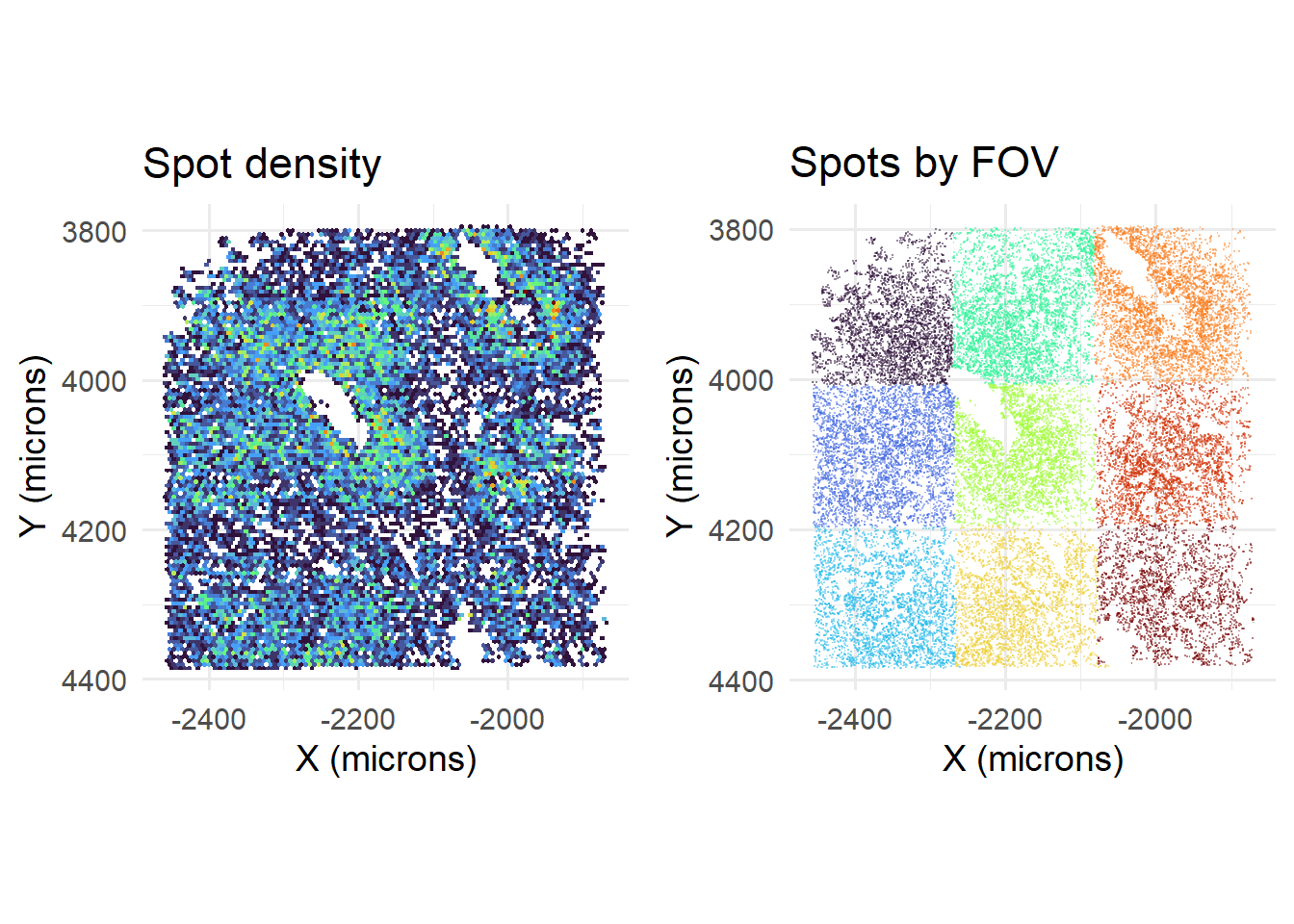
…and reduces the number of cells and counts per cell.
cellExp <- data.table::fread(paste0(params$parent_out_dir, '/OUT/OUT_CELLEXPRESSION.csv.gz'), data.table = F)
rownames(cellExp) <- cellExp[,1]
cellExp[,1] <- NULL

hist(log10(1+colSums(cellExp)),
     main = paste0(
       'Cells x genes: ', paste( dim(cellExp), collapse=' x '),
       ', Median nCounts: ', median(colSums(cellExp))),
     breaks=25, xlab = 'Log10 nCounts per cell');
abline(v=log10(1+median(colSums(cellExp))), col='red')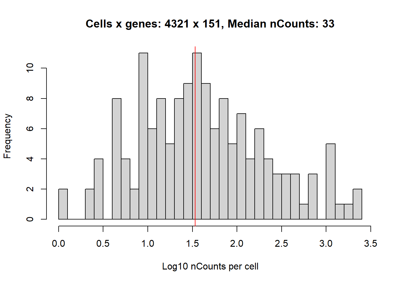
One final feature to consider is the use of the subsetFOV field. This is used when your FOVs are disjoint, i.e. not connected to each other (such as when there are multiple samples on the microscopy stage, and the FOVs in between samples are not captured). In such cases, one needs to subset just the FOVs belonging to one intact block.
fovs_belonging_to_sample <- c(
  'MMStack_1-Pos_002_004',
  'MMStack_1-Pos_002_002',
  'MMStack_1-Pos_002_003'
)
synthesiseData(removeRedundancy = T, cellOverlapFraction = 0.25, subsetFOV = fovs_belonging_to_sample)
Note that by subsetting, subdirectories within \OUT are created named in the SUBSET_{ Reference FOV } format. WARNING: It is assumed that no two subsets will have the same Reference FOV. [For more control over folder names, users can use the customOutDirName parameter in synthesiseData.]
print( params$out_dir )## [1] "C:/Users/kwaje/Downloads/JYOUT/OUT/SUBSET_MMStack_1-Pos_002_002/"Accordingly, the output within this subdirectory is only a subset of all the processed FOVs.
spotcalldf <- data.table::fread(paste0(params$out_dir, '/OUT_SPOTCALL_PIXELS.csv.gz'), data.table = F)
cowplot::plot_grid( plotlist=list(
  ggplot() +
    geom_hex(data=spotcalldf, aes(x=Xm, y=Ym), bins=100) +
    scale_fill_viridis_c(option='turbo') +
    scale_y_reverse() +
    theme_minimal(base_size=14) +
    xlab('X (microns)') + ylab('Y (microns)') +
    theme(legend.position = 'none') +
    coord_fixed() +
    ggtitle('Spot density'),
  ggplot() +
    geom_point(data=spotcalldf, aes(x=Xm, y=Ym, colour=fov), shape='.', alpha=0.5) +
    scale_colour_viridis_d(name = '', option='turbo') +
    scale_y_reverse() +
    theme_minimal(base_size=14) +
    xlab('X (microns)') + ylab('Y (microns)') +
    guides(colour=guide_legend(override.aes = list(size=5, shape=16), ncol=1)) +
    coord_fixed() +
    theme(legend.position = 'none') +
    ggtitle('Spots by FOV')
), nrow=1)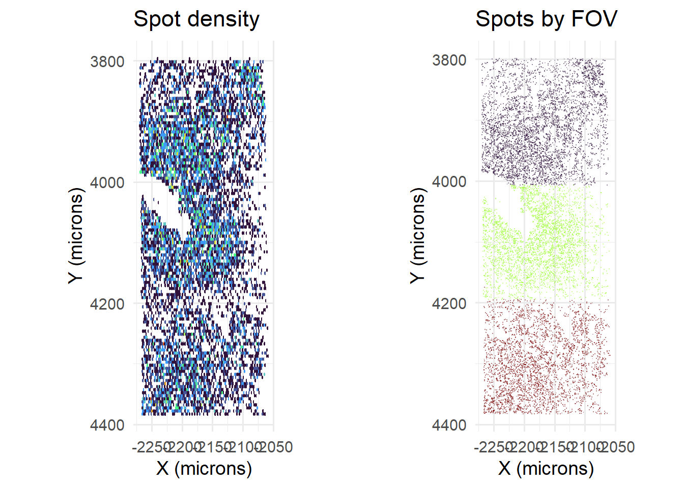
7.2 QC plotting
We have provided a plotQC function that returns several default QC plots as .png files. This function depends on parameters input during establishParams: e.g. if fpkmFileName is missing, then FPKM correlations will not be plotted. Additionally, if users ran prepareCodebook with exhaustiveBlanks, the newly added blanks will be flagged. [Users wishing to ignore these new blanks can set includeNewBlanks in plotQC to FALSE (see below).]
plotQC(
  includeNewBlanks=T,
  synthesisDir = 'C:/Users/kwaje/Downloads/JYOUT/OUT/' #To refer to previously generated (un-subset) output
  )
The interpretation of these plots will be covered briefly below.
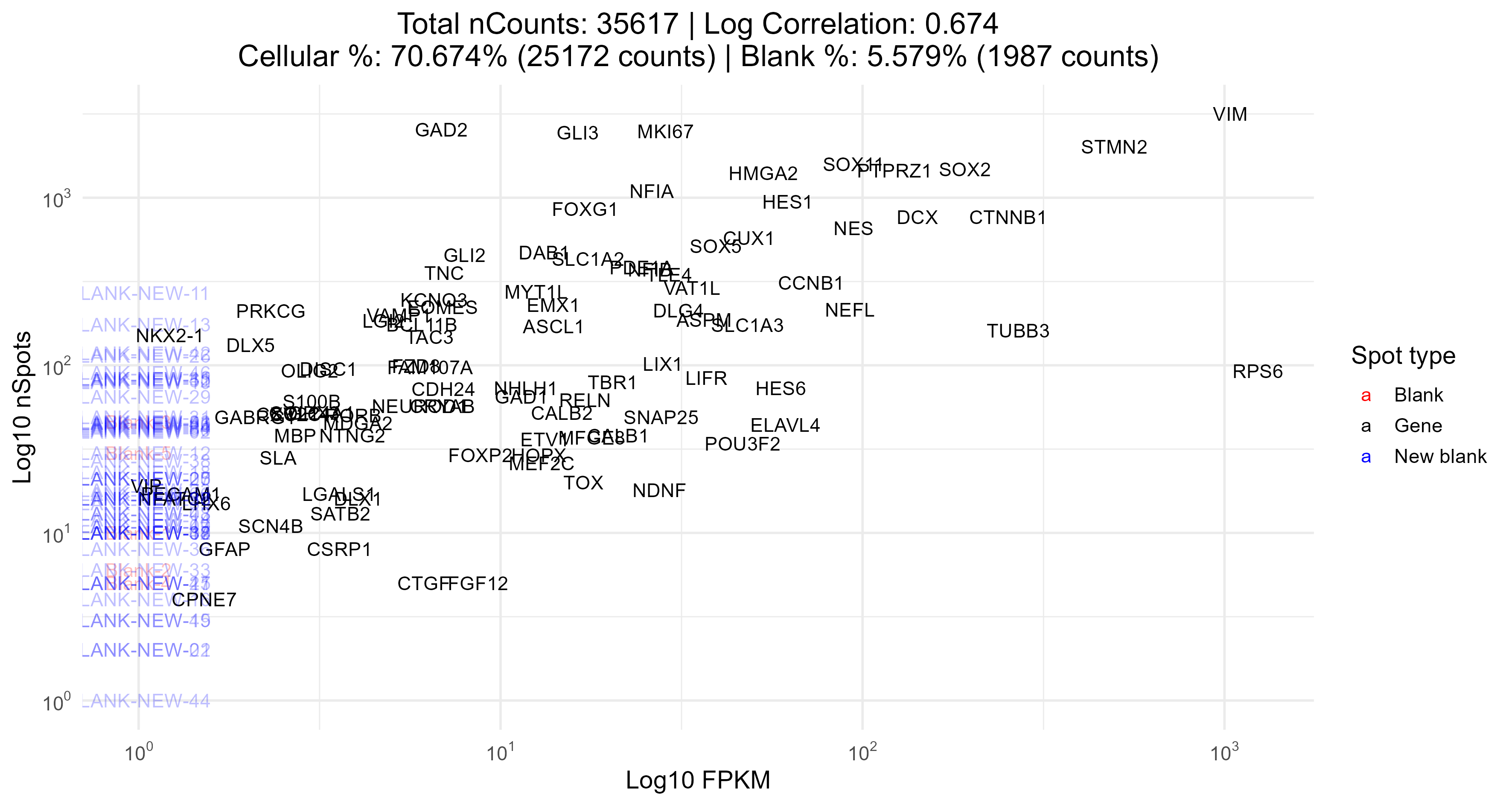
FPKMCorrelation
This plot returns the correlation between expected expression and the number of spots actually observed (bot log-transformed); strong correlations are ideal. In the title of this plot, we also report the percentage of spots that are blanks (specifically those with blank in their names), and the percentage of spots that overlap a cell mask.
CosineDistanceDistribution
This shows a distribution of cosine distances (COS) per gene. Lower cosine distances implies higher confidence in the decoding of that spot.

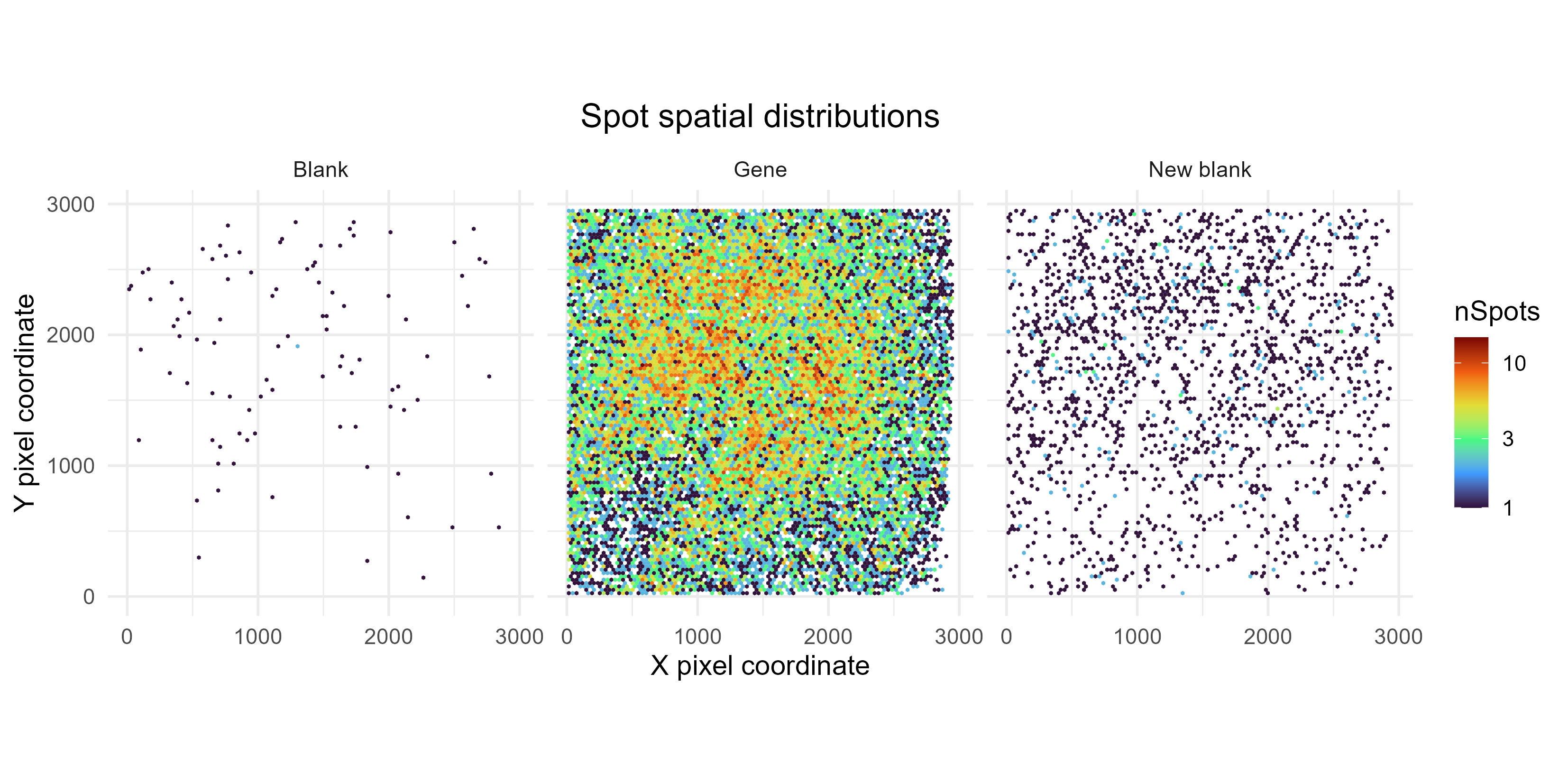
SpotFOVDistribution
This shows the distribution of spots, averaged across FOVs. This is used to check if spot coordinate in a given FOV influences its detection rate – ideally, this should not occur. If e.g. spots are more frequently detected in the centre of the FOV than the edges, this could suggest uneven lighting and a need to correct for that during image processing. [This plot is less useful if only a handful of FOVs were processed.]
Note that this plot was created from all SPOTCALL files, without removing redundant spots.
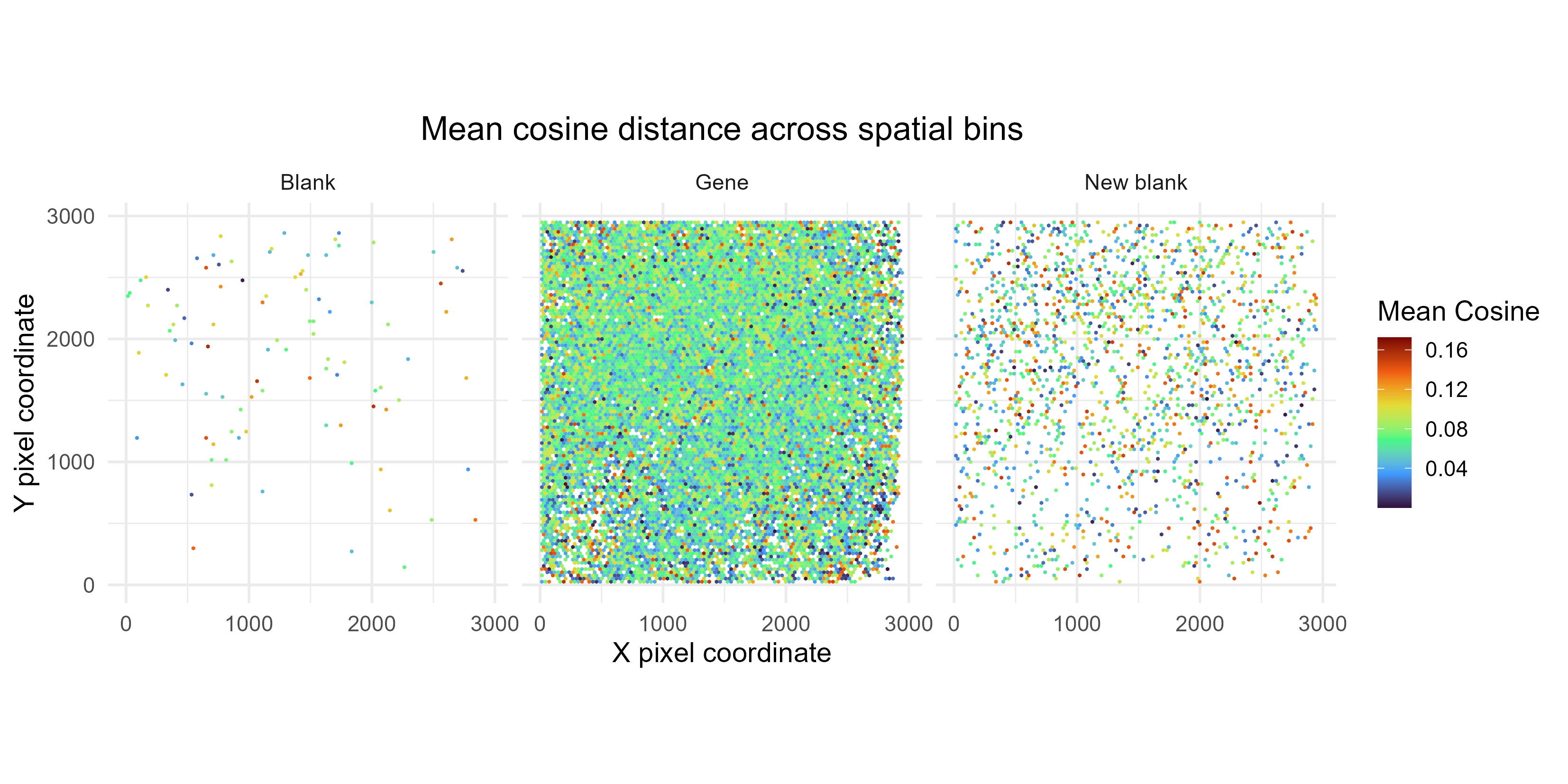
CosineSpatialDistribution
This plot shows the average cosine distances per 2D bin, across the entire tissue. Ideally, spatial location should not influence confidence in spot calls.
Note that – like SpotFOVDistribution – this plot was created from all SPOTCALL files, without removing redundant spots.
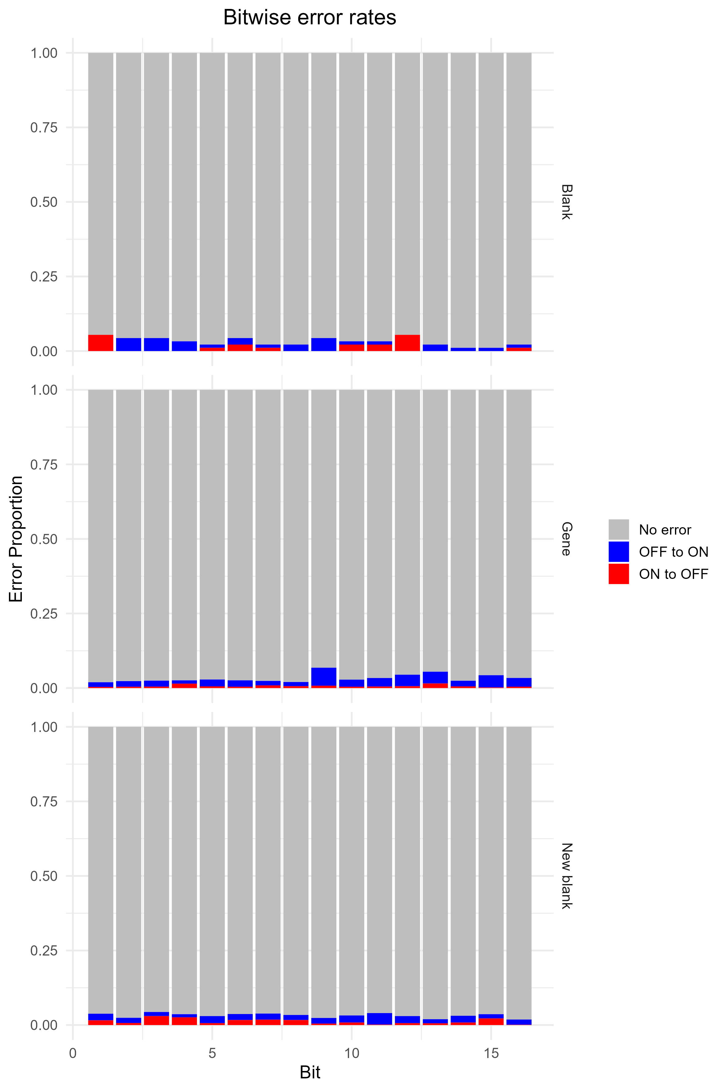
BitDetectionRate
This shows how the ON / OFF status for each bit influences the number of spots called. We tabulate the number of spots per gene, and then split the genes into two groups for each bit: if they have a ON (1), or an OFF (0). This provides some indication as to whether separation of 0 vs 1 is clearer / more ambiguous for certain bits. Ideally, there should be no obvious bias in detection rate for any bits.
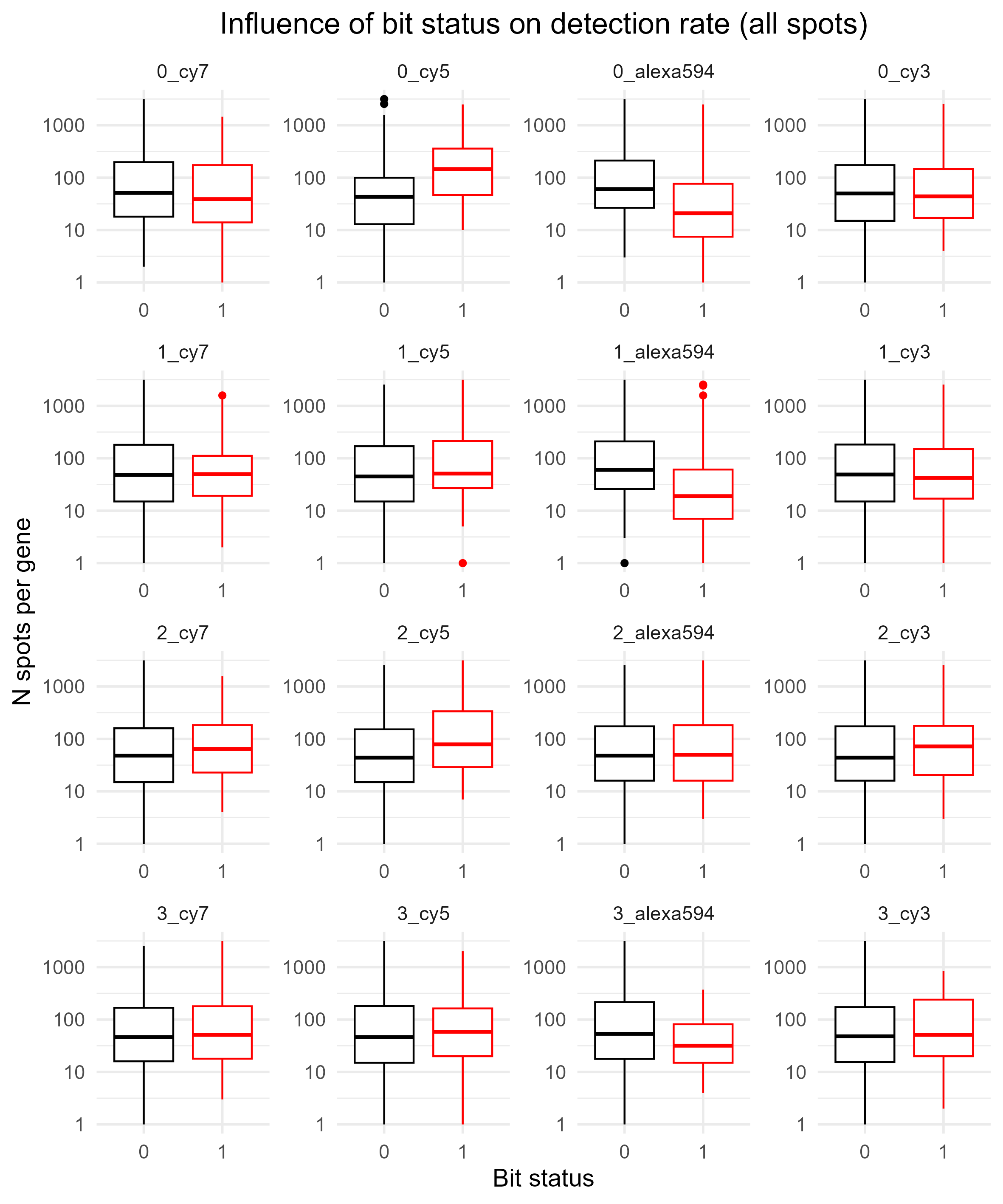
Below shows the same, but this time for spots that are non-blanks (BitDetectionRateNonBlank.png, instead of BitDetectionRateAll.png).
![]()
BitwiseErrorRates
This barplot shows the percentage of ON to OFF and OFF to ON errors for every bit. Only reported if bitsFromDecode was run during spotcalling.
From (Chen et al. 2015), ON to OFF error rate is expected to be about 10%, and OFF to ON is about 4%. Of course, this might vary depending on data set and choice of hyperparameters during decoding.
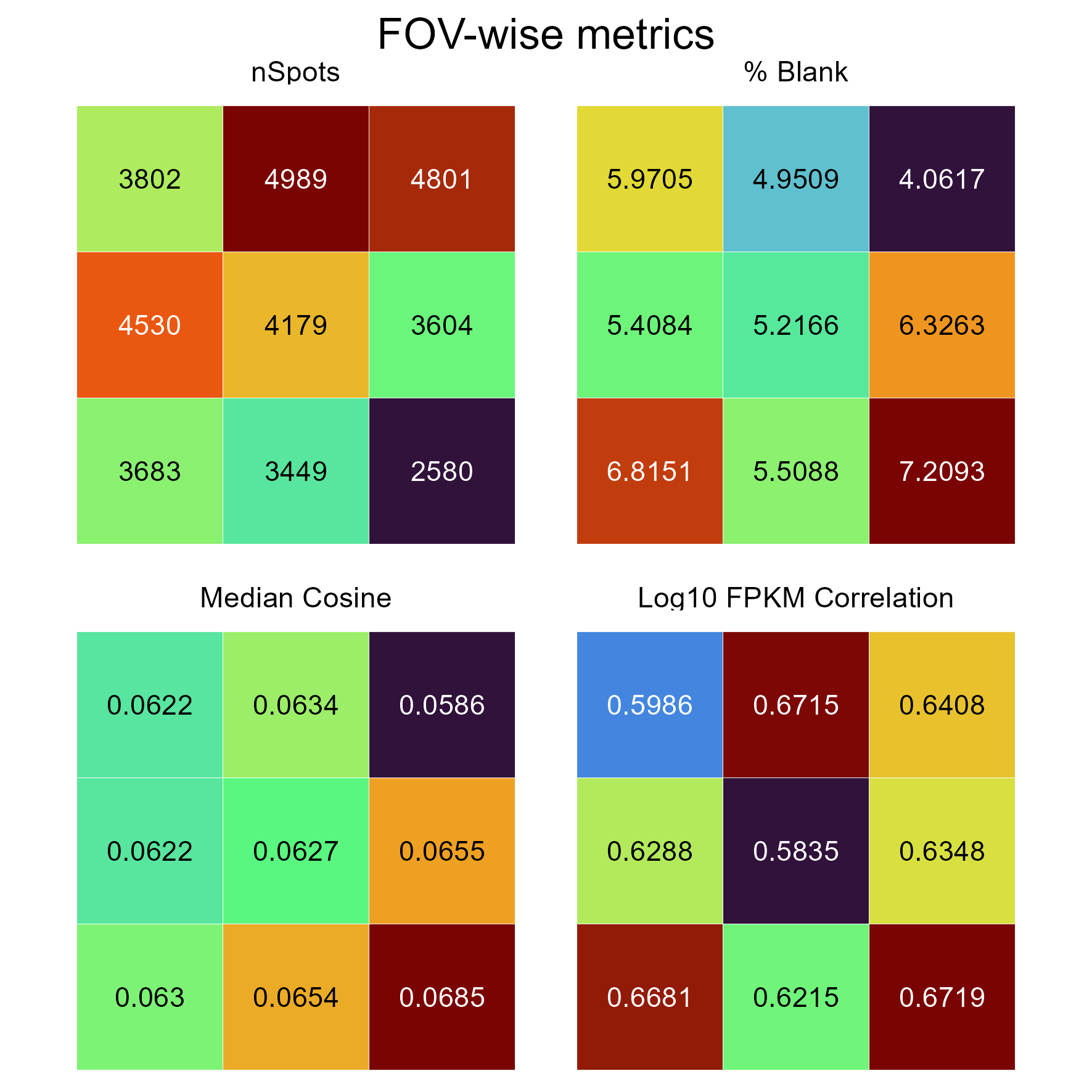
FOVMetrics
This shows some statistics averaged per FOV. Useful for determining if there are systematic failures in spot calling for certain FOVs.
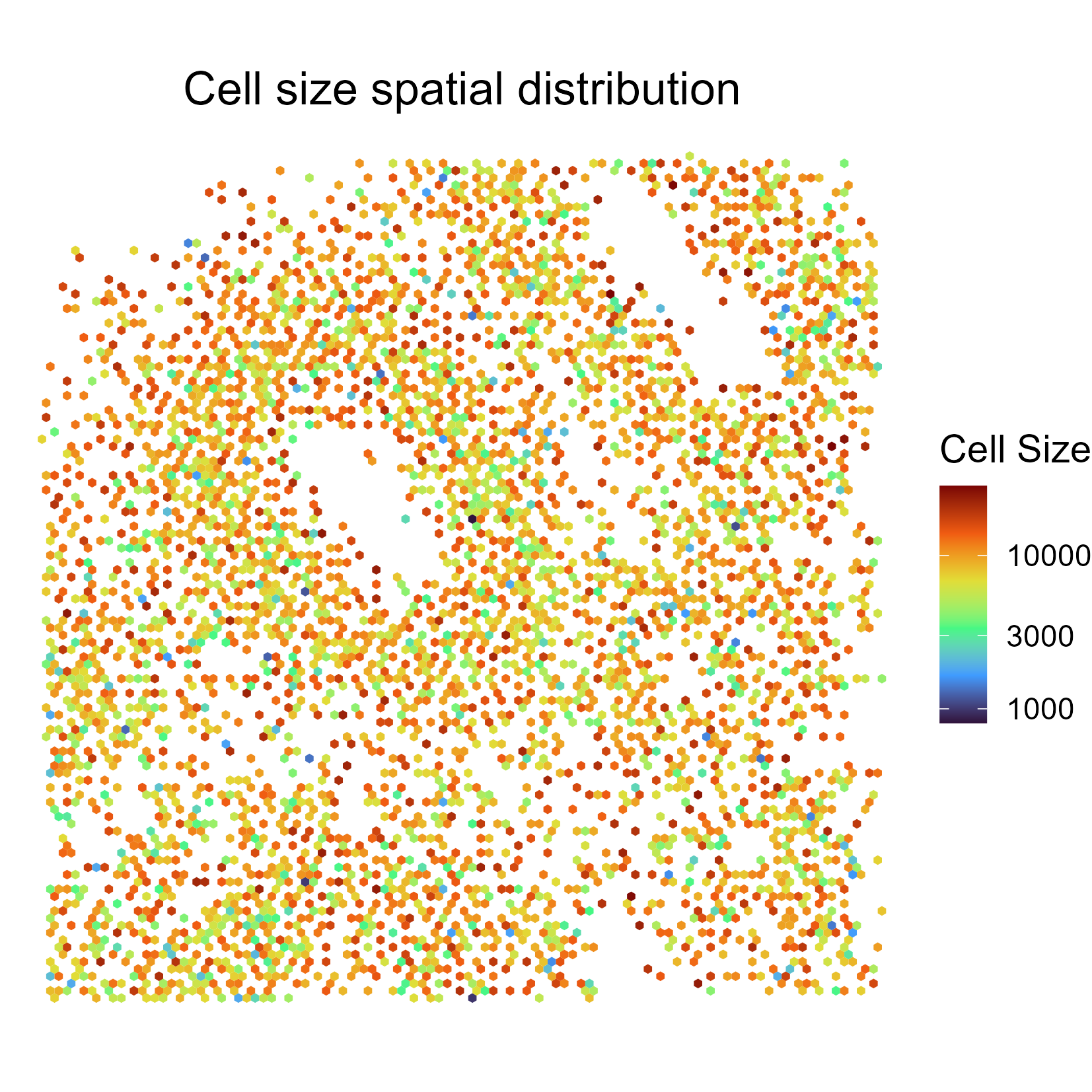
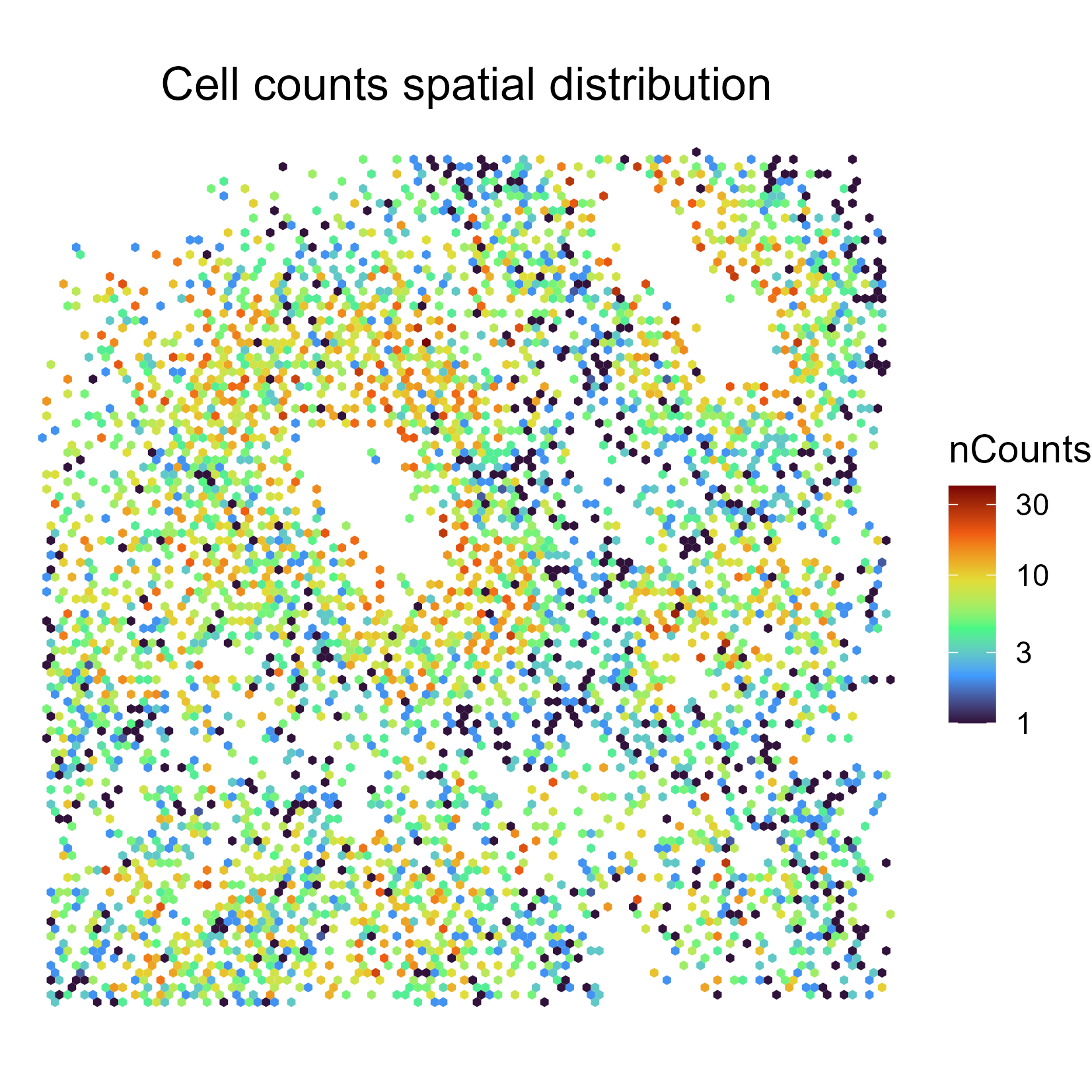
CellMetrics
This shows cell-wise metrics. Below, we show average cell size (in pixels) per 2D bin.
Below shows average number of spots per 2D bin.
SpatialPatterns
This comprises two related plots. The first comprises the SpatialPatterns themselves. As default, we typically return four or fewer spatial patterns.
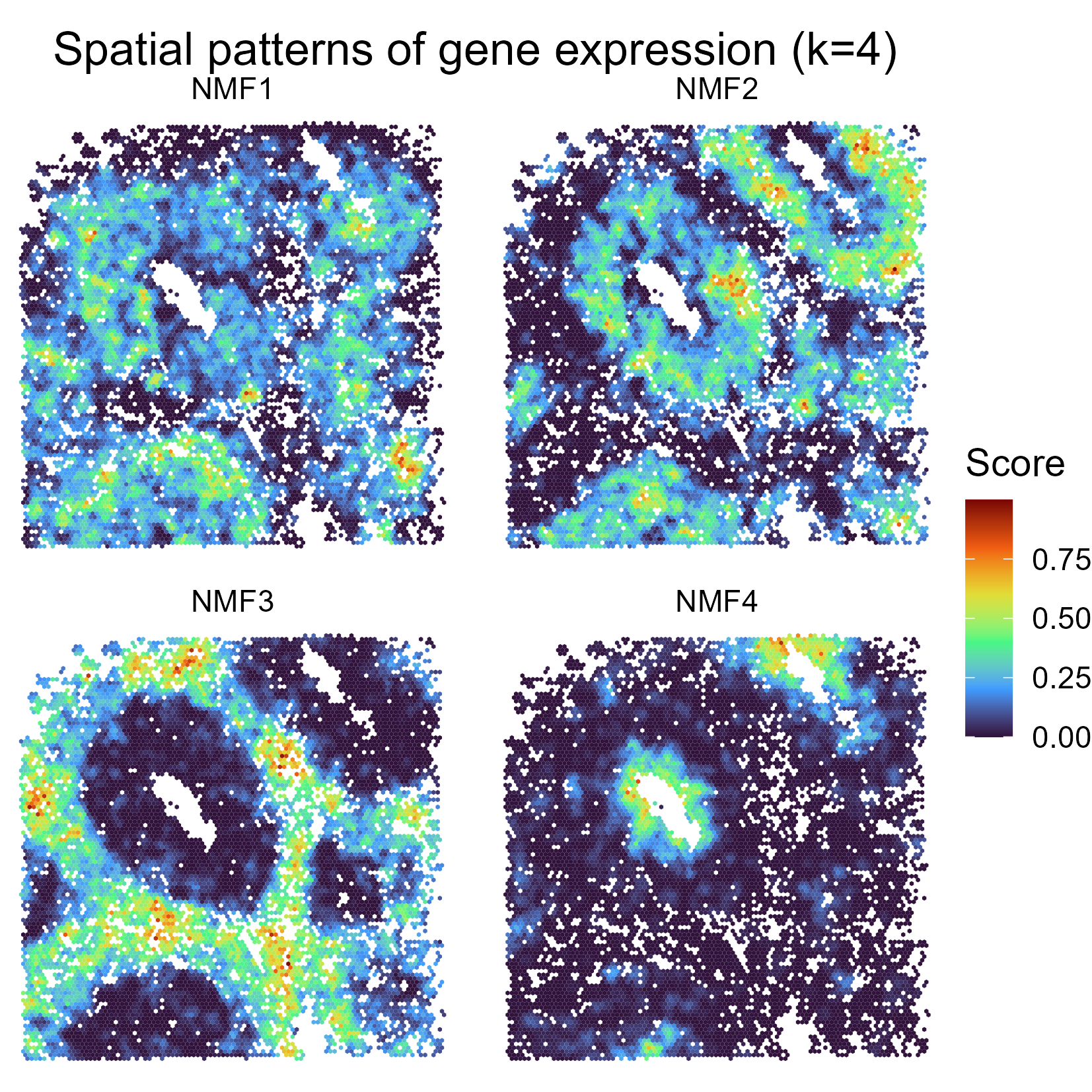
The second is GeneMembership, and is used to determine how much each spatial pattern contributes to a given gene’s expression pattern.
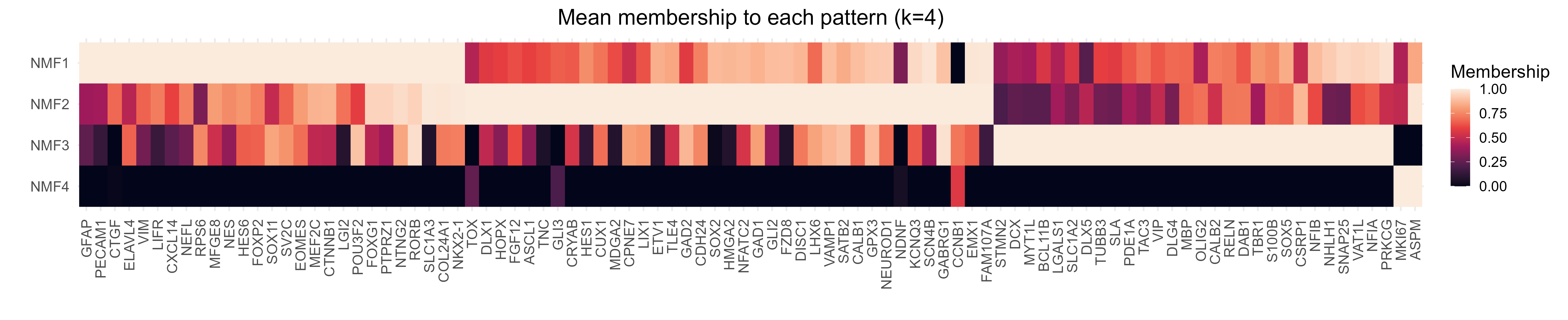
These plots provide a quick way for users to determine if their genes are adopting spatial patterns of expression that matches their expectations.
We also acknowledge that this analysis may have applications beyond QC. For users wishing to tune this analysis for their own downstream use (e.g. including more/fewer factors etc), we will now explain how these plots are generated under the hood.
7.3 Explaining how spatial patterns were identified
We first generate a table indicating how often a given gene X is a neighbour of gene Y. There are several ways to do this; we have found a fast and scaleable solution by creating a graph of spots with Delaunay triangulation, then scanning for neighbours at increasing degrees. For each spot belonging to gene X, calculate how often it is a neighbour of gene Y. [A first degree neighbour of a spot is immediately connected to that reference spot in a graph. Second degree neighbours are connected to first degree etc.]
Users may alternatively, or simultaneously, wish to consider physical Euclidean distances (i.e. genes within 5 microns of a coordinate, within 10 microns etc). This method is typically slower and more memory intensive.
Both can be accomplished with our getPNNMatrix function (PNN stands for “Point’s Nearest Neighbour”).
[Note: when run inside plotQC, the output of getPNNMatrix is saved as its own .csv file.]
nearestNeighbourMatrix <- getPNNMatrix(

  x = spotcalldf$Xm, # The x coordinate
  y = spotcalldf$Ym, # The y coordinate
  label = spotcalldf$g, # The category that a given spot belongs to

  delaunayTriangulation = T, # Whether to use Delaunay Triangulation approach
  delaunayDistanceThreshold = 20, # Ignore links longer than this distance (Xm is in microns, so this is 20 microns)
  delaunayNNDegrees = c(1:3), # Consider 1st, 1st + 2nd, and 1st + 2nd + 3rd order neighbours

  euclideanDistances = c(5, 10), # Consider spots <5, and <10 microns away
  verbose = F # Turn off messages
)
print( paste0('Dimensions of nearest neighbour matrix: ', paste(dim(nearestNeighbourMatrix), collapse = ' x ') ))
## [1] "Dimensions of nearest neighbour matrix: 13145 x 735"knitr::kable( nearestNeighbourMatrix[1:5, 1:5], format = 'html', booktabs = TRUE )| DT1_ASCL1 | DT1_ASPM | DT1_BCL11B | DT1_Blank-1 | DT1_Blank-2 |
|---|---|---|---|---|
| 0 | 0 | 0 | 0 | 0 |
| 0 | 0 | 0 | 0 | 0 |
| 0 | 0 | 0 | 0 | 0 |
| 0 | 0 | 0 | 0 | 0 |
| 0 | 0 | 0 | 0 | 0 |
The end product is a table with spots as rows, and how often it gene Y is its neighbour for a given distance as columns. This table has many uses: e.g. users can look to see how the probability of gene X is a neighbour of gene Y changes with distance. For our plots, we use this matrix to cluster genes into spatial patterns.
[Note: getPNNMatrix is not just confined to looking at spatial patterns of genes, but can be applied to any point data (e.g. cell coordinates and cell types).]
Clustering is accomplished here with non-negative matrix factorization (NMF). The number of ‘clusters’ (aka ‘factors’) is defined by the user. How to choose the appropriate number of factors is more of a personal decision, but the literature provides some helpful guidelines:
- Estimate from the number of Principle Components that explain X% variance of your data (or use an elbow plot).
- Try different numbers of factors and find the elbow where the reduction in residuals (e.g. sum of squared error) plateaus.
[Note: we chose NMF because of the speed of the RcppML package. Users may also explore other approaches to clustering: e.g. hierarchical clustering, leiden etc.]
To do so, users can use our getPNNLatentFactors function. This function not only runs NMF, but also merges similar factors together (based on a Pearson correlation threshold indicated by correlationThreshold).
resultsOfNMF <- getPNNLatentFactors(
  nearestNeighbourMatrix,
  nFactors = 4, #Number of factors specified here
  mergeSimilarFactors = TRUE,
  correlationThreshold = 0.1, #If correlation >0.1 in W matrix ('point_scores'), merge
  verbose = F
)
print( names(resultsOfNMF) )
## [1] "n_factors" "point_scores" "coefficients"What is returned is a list of three objects:
n_factors: the number of factors (after merging, if merging occured).point_scores: the “score” for each row ofnearestNeighbourMatrix(i.e. spot) in each of the factors (aka the W matrix). These have undergone min-max scaling per factor.coefficients: the “score” for each column ofnearestNeighbourMatrixin each of the factors (aka the H matrix). These have undergone min-max scaling per factor.
point_scores is most relevant here, and can be appended to spotcalldf to tell us the score for each spot – which we then plot in SpatialPatterns (averaging over 2D bins) and GeneMembership (averaging per gene).
[Note: getPNNLatentFactors can actually be applied on any non-negative matrix, not just the one returned by getPNNMatrix.]
7.4 Next steps
Yay! Your MERFISH pipeline is now done. If satisfied with the results, downstream analysis can be done on OUT_CELLEXPRESSION.csv.gz matrix – which contains cell-wise gene expression – using standard single cell RNA-sequencing pipelines. [More advanced bioinformaticians may wish to perform custom analysis to address e.g. lower counts per cell in spatial technologies (that violates assumptions of some normalisation algorithms used in scRNA-seq).]
If unsatisfied, users can go back and re-process their data with tweaked parameters. Suggestions for troubleshooting are provided in the next chapter.